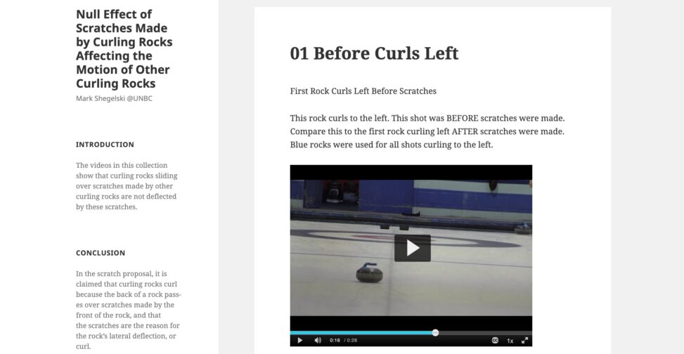
Mark Shegelski from UNBC created this site to share the full results of an experiment exploring the dynamics of motion of a curling rock.
Why is this site inspiring to you?
This site uses the WordPress structure to display all element of this experiment (hypothesis, methods, conclusion) and the supporting evidence all in a single display. It subverts the typical construct of a WordPress site as being a collection of “posts” that are just organized by publishing date. Mark has managed to get everything on one display in a way that makes it inviting to explore.
The videos provide a useful means to see the way the experiment was conducted, and in a way the viewer can examine them.
Also, the very name of the site makes me curious to visit — and that is what happened, I saw it listed on the openETC site and the title made me curious to click the link.
Who should see this site?
I would share this with teachers who ask their students to publish the results of an experiment; it is much more innovative, and useful, as a web site rather than a typical document.
What ideas/elements from this site might you want to use in your own work?
This is interesting to me as a web designer to think of using the sidebar as an additional structure of information to a site. The format looks useful as a means to show the steps in a process.
Where is this site?
Check it out at https://curling.opened.ca/

Provide Feedback
Have you looked at this site? Are you inspired to? Tell us what you find